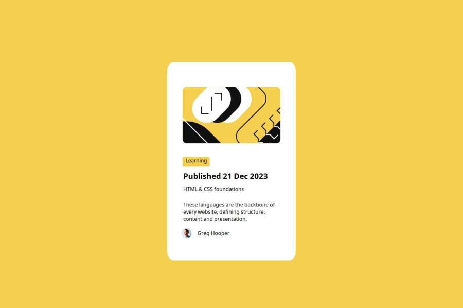
Design comparison
Solution retrospective
I would like to use better flex next time. My attempt is really not a good practice because I failed to list all the items on a column with their left edges on a single line, respectively. This is because of my inexperience with flex, and I believe I will do better and smoother next time.
What challenges did you encounter, and how did you overcome them?Generally speaking, I encountered two challenges.The first challenge is that I failed to manipulate the svg directly through flex, and I solved this with the help of AI. This really wasted me a lot of time. The second challenge is my inexperience with flex, however, after several failures, I think I will save much time in the next project.
What specific areas of your project would you like help with?I am really inexperienced with svg pictures. In real projects, are developers still frequently using svgs? I doubt that turning a svg into an img is more convenient for constructing items stream and achieving some specific effects such as round borders. If we inevitably need to deal with svg pictures, I really wish that you can share me a tutorial about svgs and how to manipulate them. Thank you a lot!
Community feedback
- @Abdullah-trialPosted 6 months ago
You did a great work. Pls consider my candid suggestions:
- Use box-shadow (10px 10px)
- Reduce the card padding in all direction
- "Published 21 Dec 2023" should be in a paragraph element
- "HTML & CSS Foundation" should be in a header element Continue coding, plactice makes perfect.
Marked as helpful1
Please log in to post a comment
Log in with GitHubJoin our Discord community
Join thousands of Frontend Mentor community members taking the challenges, sharing resources, helping each other, and chatting about all things front-end!
Join our Discord
