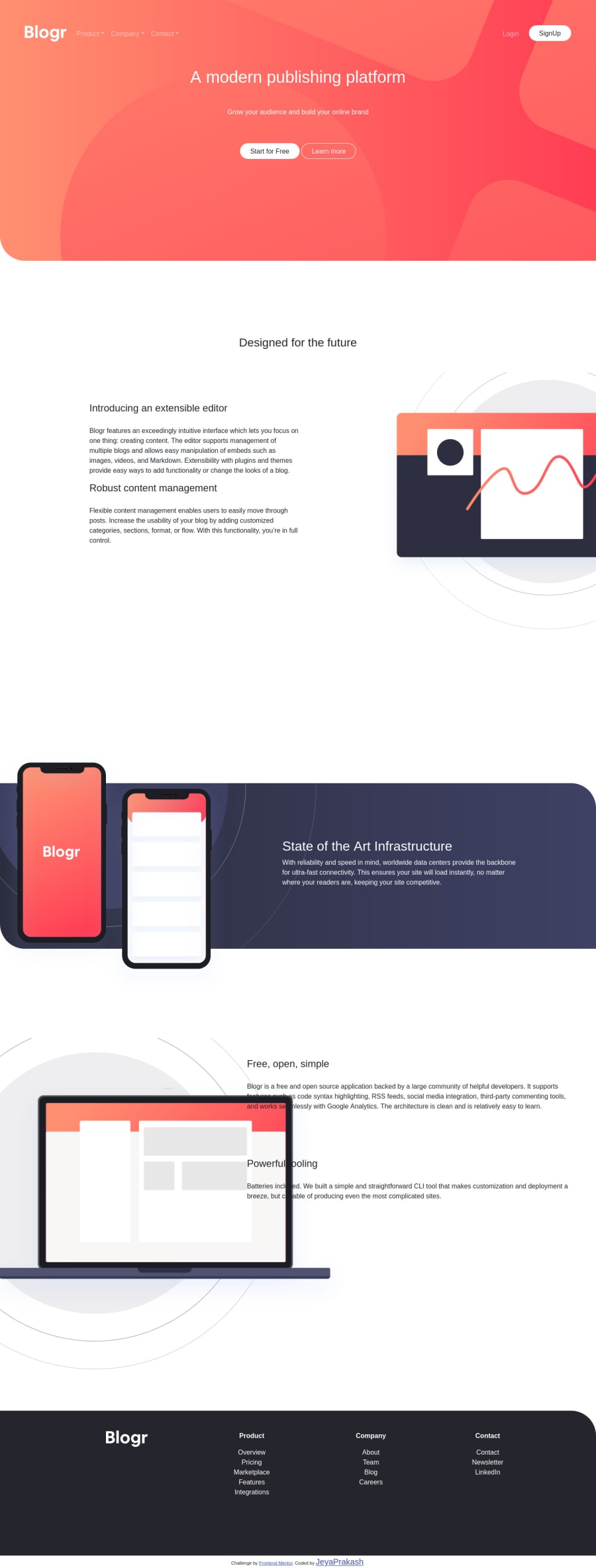
Design comparison
SolutionDesign
Solution retrospective
feedback or errors or corrections please let me i will improve it
Community feedback
- @ChamuMutezvaPosted about 3 years ago
see the report for errors that needs fixing, they might include the following
- the site is missing a heading level
h1- that's very important - headings elements should ascend in order. h1, h2 , h3 etc
- the following looks like an
aelement to me , its a link to another page<button type="button" id="btn" class="btn btn-outline-light rounded-pill px-4">Learn more</button> - alt values must be descriptive for the benefit of assistive tech users to visualize the message that is being put through, it the image is decorative use
alt="" - the following image is missing an alt value
<img src="/images/logo.svg"> - there is still some work to be done for the page to be responsive - a lot of white space and content sitting on top of other content (mobile and medium devices)
Marked as helpful1 - the site is missing a heading level
Please log in to post a comment
Log in with GitHubJoin our Discord community
Join thousands of Frontend Mentor community members taking the challenges, sharing resources, helping each other, and chatting about all things front-end!
Join our Discord
