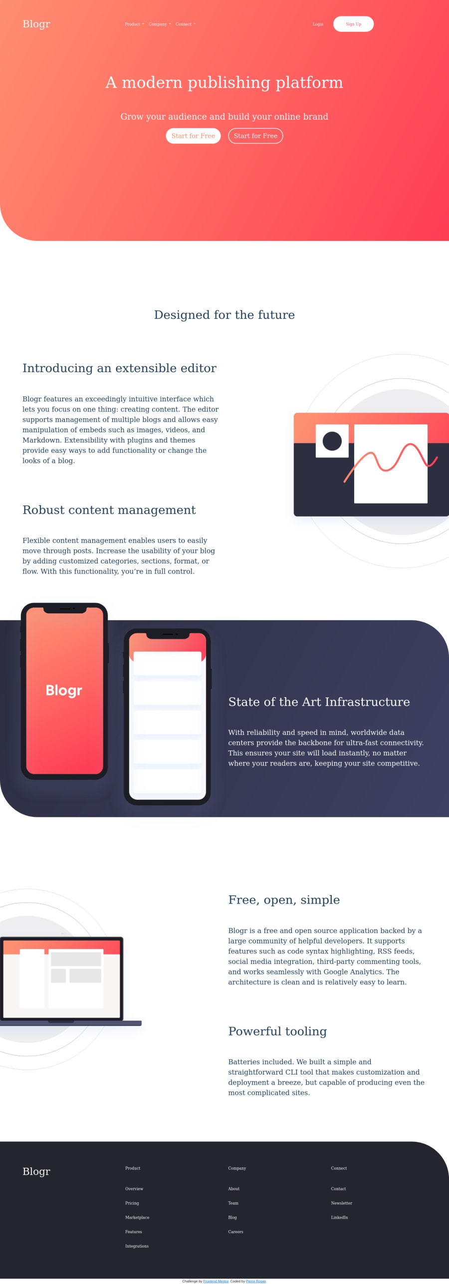
blogr-landing-page-main using HTML, Sass, Bootstrap 5 and JS
Design comparison
Solution retrospective
I'm human, so I'm imperfect by nature :) Here is my proposal for this challenge. Don't hesitate to give me your feedback on my mistakes, so that I can improve. Thanks in advance.
Community feedback
- @ameyadeokulePosted over 3 years ago
The overall webpage looks goods on all screen sizes. Good Job!! I would like to point out that the font hasn't loaded so you can fix that, The sizes of the font don't match the design and its sizes are not consistent, for example, the paragraphs and footer links should be of the same size but they are not. The buttons both say the same thing instead of "learn more". The Logo should be bolder than what you have used and the method you have used to open the menu in the mobile view is not a good one. I see this is your first full-page challenge so you not be discouraged by changes suggested to your code but see this as an opportunity to grow as a dev. You can read about typography [here] (https://madebyshape.co.uk/web-design-blog/heres-why-typography-is-so-important-for-your-website) and your mobile menu can be fixed with the method mentioned [here] (https://css-tricks.com/responsive-menu-concepts)
0@pierrerosierPosted over 3 years ago@ameyadeokule Thank you for all your constructive comments!
0
Please log in to post a comment
Log in with GitHubJoin our Discord community
Join thousands of Frontend Mentor community members taking the challenges, sharing resources, helping each other, and chatting about all things front-end!
Join our Discord
