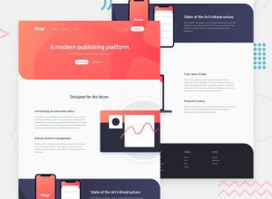
Design comparison
SolutionDesign
Solution retrospective
Here is my solution for this challenge. I feel I could have done better in some areas so please feedback will be appreciated. Thank you.
Community feedback
- @ChamuMutezvaPosted almost 3 years ago
Greetings Jesse
- your alt values must be descriptive for the benefit of assistive technology users. Alt values must tell the user the message that is being put across by the image or the function of the image in cases where the image is nested in an interactive element (button)
heading elements
- the first heading element of your site should be an h1.
- use the h1 sparingly, the best practice is to use only one h1 element per page.
- heading elements must follow a sequential order without skipping headings. The next heading after an h1 will be an h2, then an h3 etc.
footer
- the links has to be anchor elements, the li elements should have an anchor element as a child - those are navigation links to other pages .
general
- find a way to have one navigation, having one navigation for mobile and another for desktop is not best practice. Using css the navigation can be properly placed at all times
- some errors that needs fixing are listed in the automatic generated feedback
1@JesseOlisaPosted almost 3 years ago@ChamuMutezva Thank you. I will work on that now
0
Please log in to post a comment
Log in with GitHubJoin our Discord community
Join thousands of Frontend Mentor community members taking the challenges, sharing resources, helping each other, and chatting about all things front-end!
Join our Discord
