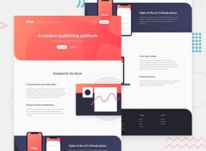
Design comparison
Solution retrospective
Oh man, CSS style and responsive design is no joke. This project taught me how to include linear gradients over background-image, it took some time but I believe I got it to where it meets the requirements. Long days and nights, so please share some knowledge on CSS responsive design.
Community feedback
- @RahulKumarGautam1636Posted about 3 years ago
Don't use bootstrap. First focus on the basic css and html. Once you get comfortable then go for it, otherwise it will be too much confusing and frustrating in my opinion. I've completed it, you may chek it out.
0 - @ChamuMutezvaPosted about 3 years ago
There are several things that needs fixing :
- heading elements must ascend in order. H1, H2, h3 etc. One h1 element is recommended.
- alt messages are not clear enough to help those who rely on assistive technology. Let the user be able to visualize from the alt text.
- you are not comfortable with css yet. Do not use bootstrap or any other framework until you understand the basics of the mother language.
- choose a challenge of a lower level before attempting a challenge of this level and see if you can get it to be responsive
0 - @afrusselPosted about 3 years ago
Both mobile and desktop view have problem. I will send you a solution soon.
0
Please log in to post a comment
Log in with GitHubJoin our Discord community
Join thousands of Frontend Mentor community members taking the challenges, sharing resources, helping each other, and chatting about all things front-end!
Join our Discord
