Design comparison
Solution retrospective
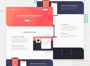
Hi guys, I built this one using reat, it took much more time than I expected mainly because whenever you get you hands dirty with a new piece of tech there are a infinete about of questions you need to find good answers for. For instance structuring the project, I would really apperiate if you guys who are a bit more exprienced with react share some thoughts on this how you go about structuring.
I feel that a learned a ton doing this one and I also identified a bunch of things that I need to imporve. Beside the bg-pattern not showing on dektop view I'd be glad to hear any thoughts and qestions about my solution.
Keep coding :)
Community feedback
Please log in to post a comment
Log in with GitHubJoin our Discord community
Join thousands of Frontend Mentor community members taking the challenges, sharing resources, helping each other, and chatting about all things front-end!
Join our Discord
