

Design comparison
SolutionDesign

Solution retrospective
Feedback welcome✅
Community feedback
- @rameshkmunjalPosted about 2 years ago
Hello @Tuchpon Congratulations on meeting Blogr-Landing_page challenge.
I observe following shortcomings in your design . You can improve the page after removing them.
- In Desktop design, nav is not as per design. You have given hamburger menu in place of left and right ul.
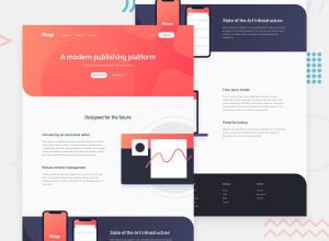
- As per design in challenge , In main part of the page ( complete page minus header and footer), in each section one side is text and other is image . in first and third section you have stacked them one over another.
- In mobile design, margin-bottom of section-2 can be reduced. Such large space is not looking well.
- Apart from above , you may find some errors in accessability report which can also be removed by slight change in your code. All page content should be contained in one landmark. So your page should be contained like this inside body tag. div.wrapper – nav – main-footer-wrapper-closed. You should use semantic html as max as you can.
I hope it helps your to improve your skills .
Thanks for reading .
1@gidhub48Posted about 2 years ago@rameshkmunjal thank you for helping me 😄and for a suggestion, i will improve this.
0

Please log in to post a comment
Log in with GitHubJoin our Discord community
Join thousands of Frontend Mentor community members taking the challenges, sharing resources, helping each other, and chatting about all things front-end!
Join our Discord