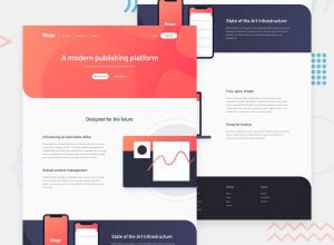
Design comparison
SolutionDesign
Solution retrospective
What specific areas of your project would you like help with?
the part where we have to set the images and the text to be displayed inline but with a little twist, the image has to be absolutely aligned to the left or the right with only half portion of the image to be visible on screen without overflowing. any idea how to achieve the same design without shifting the layout with the most efficient way possible?
any suggestions are welcome!
Community feedback
Please log in to post a comment
Log in with GitHubJoin our Discord community
Join thousands of Frontend Mentor community members taking the challenges, sharing resources, helping each other, and chatting about all things front-end!
Join our Discord
