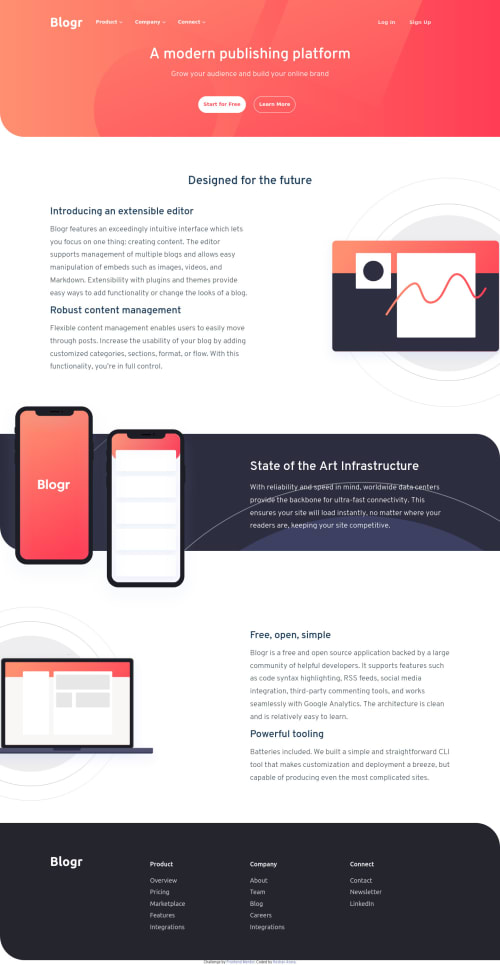
Blogr site using HTML, CSS, Flexbox and JS
Design comparison
Solution retrospective
I have built this using HTML, CSS, Flexbox, and JS. I will be grateful to have feedback on this one, it will give me some motivation to correct myself and move ahead with great people like you.
Community feedback
- @juani2Posted over 3 years ago
Hello, Looking Great!
To further improve reading experience, you may try to add little bit of white spaces on your major page sections. This will visually give more breathing room to your main page sections.
1@keshavarora2000Posted over 3 years ago@juani2 Thank you so much for your feedback. I will try to do add some white spaces later on with other projects.
0 - @vd-37Posted over 3 years ago
Hey ,good work! The thing is your desktop version website is causing an overflow(the extra width to the right). I guess it's because of the image in the second section(Designed for future section) , use overflow-x : hidden on it's parent .That should help. Also try to match the mobile-menu . Other than that website seems good.
0@keshavarora2000Posted over 3 years ago@vd-37 Thankyou for your feedback. I will try to update it and will remember it for the next time too.
0
Please log in to post a comment
Log in with GitHubJoin our Discord community
Join thousands of Frontend Mentor community members taking the challenges, sharing resources, helping each other, and chatting about all things front-end!
Join our Discord