Submitted over 3 years ago
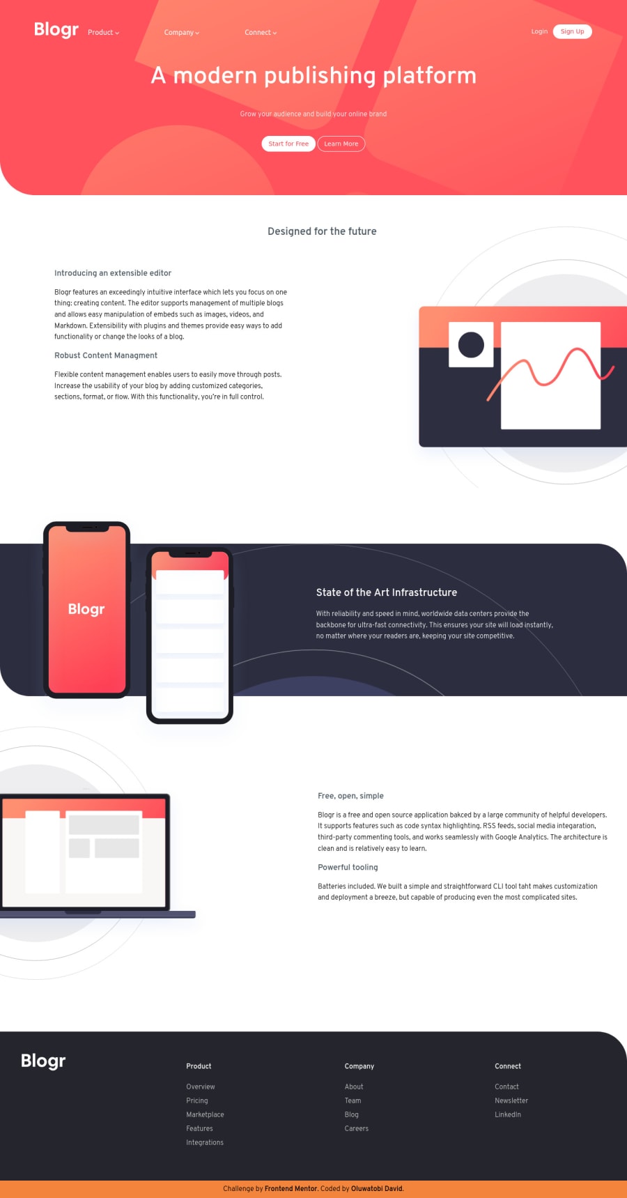
Blogr Page Using HTML, CSS, JS (grid and flexbox)
@EbvidPro
Design comparison
SolutionDesign
Solution retrospective
Hi guys, It really gave me some tough time, but it was worth it. It's fun learning. I need your feedback on
- Maintaining my Code.
- Making it shorter instead of repetition of codes.
- Advice to become a better web developer.
Thanks in Anticipation.
Community feedback
- @ApplePieGiraffePosted over 3 years ago
Greetings, David Oluwatobi Ebenezer! 👋
Nice effort on this challenge! 👏
A few things I think you can do to improve your solution are,
- Decreasing the space a bit between the submenus in the header of the page.
- Using absolute positioning for the mobile menu popup so that it doesn't get in the way of the layout of the rest of your site.
- Making sure the submenus in the desktop layout still appear when you decrease the width of the screen, open/close the mobile menu, and increase the width of the screen again (for some reason, they disappear, then).
- Wrapping the menu icons for the mobile menu in a
<button>element (since it is a type of button and that's better for accessibility).
Hope these few tips help. 🙂
Keep coding (and happy coding, too)! 😁
Marked as helpful1 - @EbvidProPosted over 3 years ago
Wow. This great. Thanks for taking your time to go through.
0
Please log in to post a comment
Log in with GitHubJoin our Discord community
Join thousands of Frontend Mentor community members taking the challenges, sharing resources, helping each other, and chatting about all things front-end!
Join our Discord
