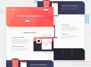
Design comparison
Solution retrospective
any feedback ?
Community feedback
- @pablo-obrachPosted over 1 year ago
Congrats on finishing the challenge!
*Everything looks pretty cool , but the desktop view doen't match like the one given to you
from Frontend Mentor challenge, it s a difficult challenge but you did great.*
Desktop view
-The background from the header it s not like the one on the original version. Check if the image is at the assets folder. Also the header needs more space from the top , you can achieved that adding a margin-top at least of 2rem. The nav-bar should be next to de Logo instead of in the middle . If you are using flex at the header you can put the logo and the nav-bar into a single div and then another div for the sign-in/log-ing so you can put them into a container into the header and apply flex to that container with the property justify-content: space-between. That could fix that
-The font should look like the ones given you by frontend mentor desktop view. You can find that info in the style-readme file . The colors for the fonts should also match with the color at the style-readme file.
-To solve the image position you can use it as a background-image for the div and position it at the right side also if you have overflow issues with a property called overflow-x: hidden you could fix that and place the image next to the texts. (those texts shouldn't be a lorem , you have the text content at the files).
The main issue i can see from your solution it s you didn't use the style-readme file and some images at the assets folder. But as i said before you did a great job and looks pretty cool.
-The JS menu works as intended so there s no opinion about that.
Hope my feedback helped you
Marked as helpful1
Please log in to post a comment
Log in with GitHubJoin our Discord community
Join thousands of Frontend Mentor community members taking the challenges, sharing resources, helping each other, and chatting about all things front-end!
Join our Discord
