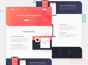
Design comparison
Solution retrospective
Not responsive design completed. Next time I do that.
Community feedback
- @elaineleungPosted over 2 years ago
Hi Sabbir, good job building this out 🙂
I just had a look at your code; you had
headermisspelt asheder, which I think could give you some issues in the report, sincehederis not an HTML element. Also, about the site not having an optimal mobile and tablet view right now, I think you can just try changing the padding andflex-directionof your sections and also add in a mobile nav in the media query, and that should be a start. It looks like the side padding is pretty much the same for all sections, so it would actually help to use a container with a padding added and then put that within each section so that you don't need to write a padding into each of the sections. Lastly, what I would do next time is to start the design on mobile view first and then use a media query for the desktop view.Good luck!
1
Please log in to post a comment
Log in with GitHubJoin our Discord community
Join thousands of Frontend Mentor community members taking the challenges, sharing resources, helping each other, and chatting about all things front-end!
Join our Discord
