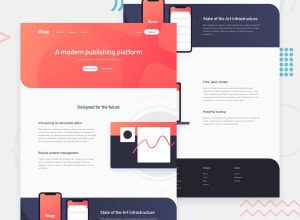
Design comparison
SolutionDesign
Solution retrospective
This was such a great challenge in terms of achieving pixel perfect designs. I used Tailwind and I found that the round tailwind classes were very extreme and opted to add vanilla css in my input.css file.
I also had challenges:
- Achieving the halfway sliced desktop laptop images.
- With the mobile sub-menus.
- With the background shapes.
This is version one. I aim to work through the above challenges slowly and one by one.
Community feedback
Please log in to post a comment
Log in with GitHubJoin our Discord community
Join thousands of Frontend Mentor community members taking the challenges, sharing resources, helping each other, and chatting about all things front-end!
Join our Discord
