Design comparison
Solution retrospective
Feedbacks are welcomed
Community feedback
- @DesignAssemblyPosted over 3 years ago
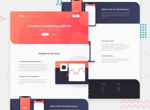
Not a bad attempt. there are quite a couple of issues. not sure if you did not push all the code but in the live preview you have both your mobile and desktop menus visible. so need to sort that out. also there is no need to create two different menus you could just use the one and style it differently depending on your media query. Everyone seems to be battling with the placement of that background image - a suggestion would be to split the gradient from the image and place the image in its own container this way you have more flexibility for placement. you % zoom on the background-size to get this right. Maybe pay attention to spacing and vertical rhythm to get your solution closer to the design other than that, not a bad attempt. good job
1
Please log in to post a comment
Log in with GitHubJoin our Discord community
Join thousands of Frontend Mentor community members taking the challenges, sharing resources, helping each other, and chatting about all things front-end!
Join our Discord
