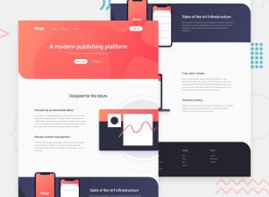
Design comparison
Solution retrospective
Tried to create a pixel-perfect Design, Any Feedback will be appreciated
Thank you
Community feedback
- @hassanahmadpPosted over 3 years ago
You did it well!
Although it is not pixel perfect, but with respect to UX principles, Your work is more user friendly... For a second I got confused, that which one is the design and which one is the solution.
There was one place where I felt that this could be a little bit better, where on the menu slide (mobile view) there is an overlay behind the menu, whereas in the design there is a box-shadow with a border-radius.
I hope this makes sense to you.
1@sijandahalPosted over 3 years ago@hassanahmadp Thank you for your feedback, Noted and fixed the small design issue. :)
0
Please log in to post a comment
Log in with GitHubJoin our Discord community
Join thousands of Frontend Mentor community members taking the challenges, sharing resources, helping each other, and chatting about all things front-end!
Join our Discord
