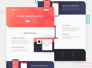
Design comparison
SolutionDesign
Solution retrospective
I'm very happy with the results of this project, I'm hoping that the code is also up to standards... (aside from the lack of variables for the colours).
I tried my best to ensure good accessibility for the HTML within this project.
I struggled with the placements of the images for a while, but I think it's close enough for now.
NOTE: Just wanted to say thanks to @pikamart for sharing their wisdom with me. It believe it really helped with building this project.
Community feedback
Please log in to post a comment
Log in with GitHubJoin our Discord community
Join thousands of Frontend Mentor community members taking the challenges, sharing resources, helping each other, and chatting about all things front-end!
Join our Discord
