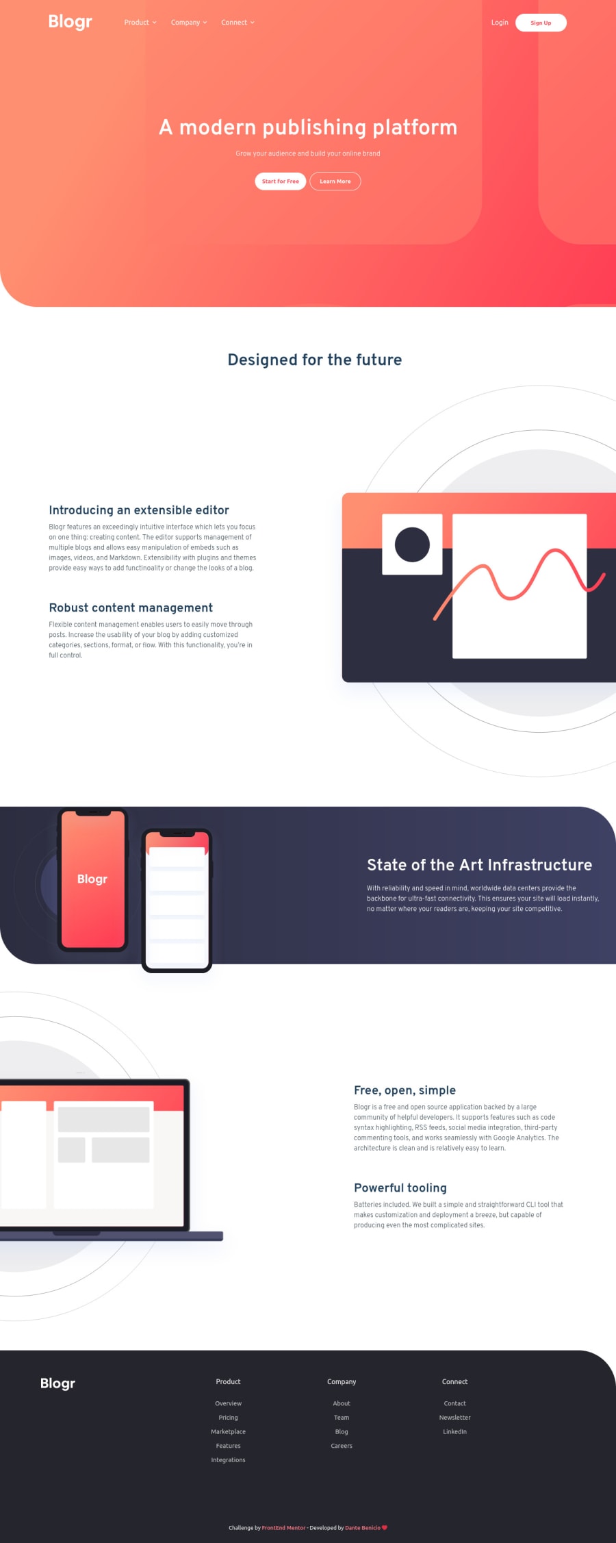
Blogr Landing Page with React, Scss/Sass and Typescript
Design comparison
Solution retrospective
I liked the development process of this project, the development of this Landing Page was very satisfactory.
send me feedback
Community feedback
- @zineb-BouPosted over 2 years ago
Hi there, your solution looks good, is nicely responsive and I love the animation on the header, here are some suggestions concerning accessibility.
- The pattern images are only for decoration, we don’t need the screen readers to read their source path, therefore we have to hide them from assistive technologies using
aria-hidden=” true” - The close button on the navigation menu is a button, so use the right HTML semantic element which is a
<button>instead of a<div>.
Good luck
Marked as helpful1@DanteBenicioPosted over 2 years ago@zineb-Bou Thanks for the tip, I'm starting to study these accessibility issues and that's why there are still things I don't know yet, but thanks, I'll do that 👍
0 - The pattern images are only for decoration, we don’t need the screen readers to read their source path, therefore we have to hide them from assistive technologies using
- @shashreesamuelPosted over 2 years ago
Hey good job completing this challenge.
Keep up the good work
Your solution looks great however I think the description next to the phone mockup is supposed to have some margin on the left using
margin-left.I hope this helps
Cheers Happy coding 👍
Marked as helpful1@DanteBenicioPosted over 2 years ago@TheCoderGuru Thanks for the tip bro, I'll do that 👍
0
Please log in to post a comment
Log in with GitHubJoin our Discord community
Join thousands of Frontend Mentor community members taking the challenges, sharing resources, helping each other, and chatting about all things front-end!
Join our Discord
