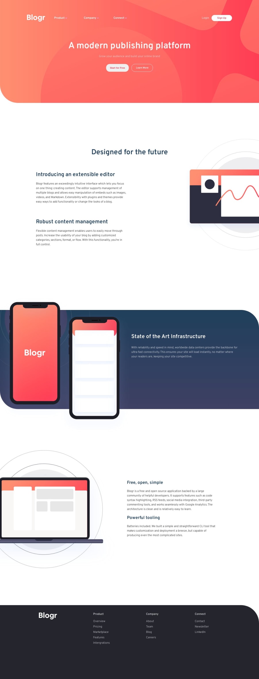
Design comparison
Solution retrospective
Hello everyone. Please I really wish for you guys to go through this exercise and tell me if there was an easier way to do it. I had a lot of difficulties but at the end i succeded. Comments shall be very much apprecaited.
HAPPY CODING
Community feedback
- @ChamuMutezvaPosted over 1 year ago
Hi Brandon
I saw your message about needing some feedback on your projects. One thing to point out is that when you submit your project, you will be able to see solutions of the same project done by others. It is also important to set time and go through one or more solutions, just to feel and see how others managed to workout the same challenge. You can also make use of the Discord channel to post your challenge in the #finished-projects just to widen your audience. Having said that here is my feedback:
- Well done for using semantic elements such as the
mainand thefooter, those are among the backbone of most sites. - I see that in your HTML, with images, where there is images for desktop and mobile , you have opted to list them . They are some techniques that are use to handle images which includes the Responsive Images 101, Part 6: Picture Element. Hiding the images using css, will work but it is not recommended
- alt values are used by assistive technology to convey the message that is carried in an image. Hence alt values should be specific and descriptive. If the image is for decorative purposes , use an alt value which is empty.
alt="" - as mentioned earlier , always use elements that are created for that specific purpose ahead of elements such as divs. I refer to the mobile version when the menu control is handled by an image. Interaction in this case should at least be handled by a button, click events should not be put on images or divs - it will require a lot more code to make it work for assistive technology.
- include a modern css reset stylesheet like the one by Andy Bell.
- Font-sizes should be written in rems but not in px, see the following article for a detailed explanation. why font-sizes should never be in px
- make your css rules as simple as possible , avoid something like the following if possible
.nav-elements ul li a
Marked as helpful1@BrandaoAPosted over 1 year ago@ChamuMutezva Thanks for the feedback. I’ll work on all what you have set
0 - Well done for using semantic elements such as the
Please log in to post a comment
Log in with GitHubJoin our Discord community
Join thousands of Frontend Mentor community members taking the challenges, sharing resources, helping each other, and chatting about all things front-end!
Join our Discord
