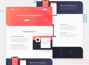
Design comparison
Solution retrospective
Any suggestions/opinions about my organization of the project would be greatly appreciated!
Thanks!
Community feedback
- @ApplePieGiraffePosted over 3 years ago
Hey, Jorge A. Mendoza II! 👋
Good job on this challenge! 👏 Your solution looks pretty good and is responsive! 🙌
One more tiny thing that I suggest (in addition to emestabillo's helpful feedback) is to consider closing any open submenus in the header navigation when another submenu is opened (if you're up for the challenge). 😉
Keep coding (and happy coding, too)! 😁
1@JorgeAMendozaPosted over 3 years ago@ApplePieGiraffe Thank you for the response! I'll try to implement your feedback thos weekend!
0 - @emestabilloPosted over 3 years ago
Hi @JorgeAMendoza, good job on this project. Site is responsive and looks similar to the design. You could, however, get closer still by tweaking the font-sizes and spacing. Two other things that I noticed:
-
I think you were going for BEM here, but
nav-bar__nav__list__option__items__itemgoes against convention and is more likeblock__element__element__element__element__element. I suggest further reading to get a better grasp such as this article -
The links and buttons could use transitions
Hope this helps!
1@JorgeAMendozaPosted over 3 years ago@emestabillo Thank you so much for the feedback!
1 -
Please log in to post a comment
Log in with GitHubJoin our Discord community
Join thousands of Frontend Mentor community members taking the challenges, sharing resources, helping each other, and chatting about all things front-end!
Join our Discord
