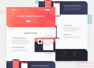
Design comparison
SolutionDesign
Solution retrospective
This template was challenging, the mobile menus were tedious.
This was my first time dealing with background images, it was by all means not simple.
If anyone has suggestions on how i can improve my code, please let me know, thank you!
Community feedback
- @shashreesamuelPosted over 2 years ago
Hey good job completing this challenge
Keep up the good work
Your solution looks great however I think that the curved background on the header is a bit too tall. Secondly the desktop mockup image needs to be a bit bigger
I hope this helps
Cheers Happy coding 👍
1
Please log in to post a comment
Log in with GitHubJoin our Discord community
Join thousands of Frontend Mentor community members taking the challenges, sharing resources, helping each other, and chatting about all things front-end!
Join our Discord
