Design comparison
Solution retrospective
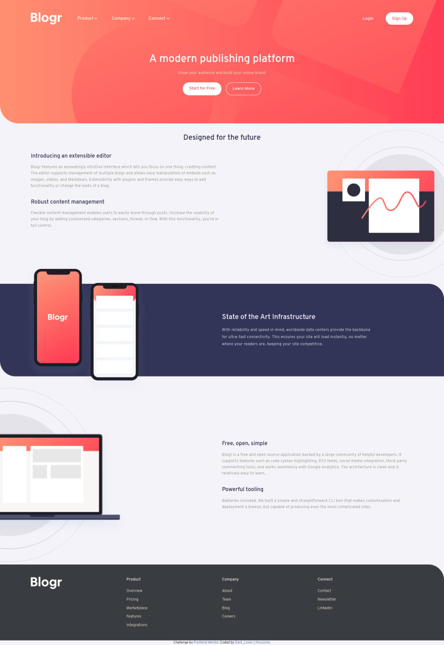
hey guys ;) . after a break of 4 months, here I'm again. I'm waiting your feedbacks.
Community feedback
- @RocTanweerPosted over 3 years ago
hello @Dark-Lover, Great work on this challenge...!
There is nothing for me to tell you after what @ApplePieGiraffe has told you...
But one of the disadvantage is that your work is not matching the design file. Use Irfan View to measure the size of any part of an image (Like the design file provided from here).
It will help you to develop the web site as close to the design as possible. You can now measure the button size or svg size or any part of any image.
Jessica Chan(Coder Coder on YT) told me that...
Hope it helps(Happy coding..!)
2@Dark-LoverPosted over 3 years agothank you dear @RocTanweer ;) i did my best to reproduce the same design, and im still having problems with text, images, sections height... sizes i will try the tool. thank you
1 - @ApplePieGiraffePosted over 3 years ago
Hello there, Dark-Lover! 👋
Welcome back (it certainly has been a while)! 😀 And nice job on this challenge! 👏
Overall, your solution looks good and responds rather well! The only thing you might want to do is to open the dropdown menus in the mobile navigation menu when they are tapped, not hovered over (since users on mobile/tablet devices typically can't hover over elements). 😉
Well, keep coding (and happy coding, too)! 😁
1@Dark-LoverPosted over 3 years agothank you dear friend @ApplePieGiraffe . guess what, i have never thought about that :D .
0 - @pikapikamartPosted over 3 years ago
Hello, great work you got there and welcome back I guess? :>>
For the layout, it seems it is smaller than the original and the font-sizes needs to be adjusted as well, since right now, it might be hard for other user to see it properly since the components are far from their complementary element. Like the first section and first image, it will be good if the font-size is adjusted and the images as well.
In terms of fluidity, your layout resizes well when going to mobile state.
The dropdown in the mobile seems bigger to what it should be, therefore creating a huge white blank section if you drop on it.
Considering those above will be awesome and overall, you did good here ^
1
Please log in to post a comment
Log in with GitHubJoin our Discord community
Join thousands of Frontend Mentor community members taking the challenges, sharing resources, helping each other, and chatting about all things front-end!
Join our Discord
