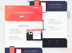
Design comparison
Solution retrospective
I'm pretty happy with my solution, although I've got the feeling the media queries could be simplified. Any feedback is welcome :)
P.S.: My initrial try was using CSS grid for the main layout, but I wasn't able to get the header background image use the full width (larger than the grid childs width). Does anyone have an idea how this could be done?
Community feedback
- @ameyadeokulePosted over 3 years ago
The website looks awesome and has a very well-written codebase. My only pointer would be to increase the font height for headers only as they are a bit smaller than the ones in the design. Keep up the GOOD WORK!!
Now to answer your question you can create a wrapper class and make it the grid container and use the original header to add the background property. You can read more about it here -> https://stackoverflow.com/questions/21127424/extending-background-color-of-div-in-grid-system
0
Please log in to post a comment
Log in with GitHubJoin our Discord community
Join thousands of Frontend Mentor community members taking the challenges, sharing resources, helping each other, and chatting about all things front-end!
Join our Discord
