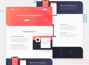
Design comparison
SolutionDesign
Solution retrospective
First build for a while. Would love some advice on how to fix my desktop menu issue. I'd also really appreaciate some feedback on how to cap things at a certain width and how to position my images correctly!
Community feedback
- @tedikoPosted over 3 years ago
Hello, Jamie Moore! 👋
Congrats on finishing another challenge! Your solution looks very good and also responds well. Here's my few tips:
- Change the
altattributes for the ilustration images, as they don't add any extra context for screen reader users. Since your images are decorative youralttext should be provided empty (alt="") so that they can be ignored by assistive technologies. - Add
:focuspseudo class to interactive elements like anchors, buttons etc. Useoutlineproperty to make your website more accessible to keyboard users. Focusable elements like anchor, buttons or inputs they have applied default:focuspseudo class withoutlineproperty. These default styles are subtle and hardly visible tho. Furthermore every browser has a slightly different default style for the outline, so you probably want to change the default style. Read more about why we should change focus styles.
Good luck with that, have fun coding! 💪
1 - Change the
Please log in to post a comment
Log in with GitHubJoin our Discord community
Join thousands of Frontend Mentor community members taking the challenges, sharing resources, helping each other, and chatting about all things front-end!
Join our Discord
