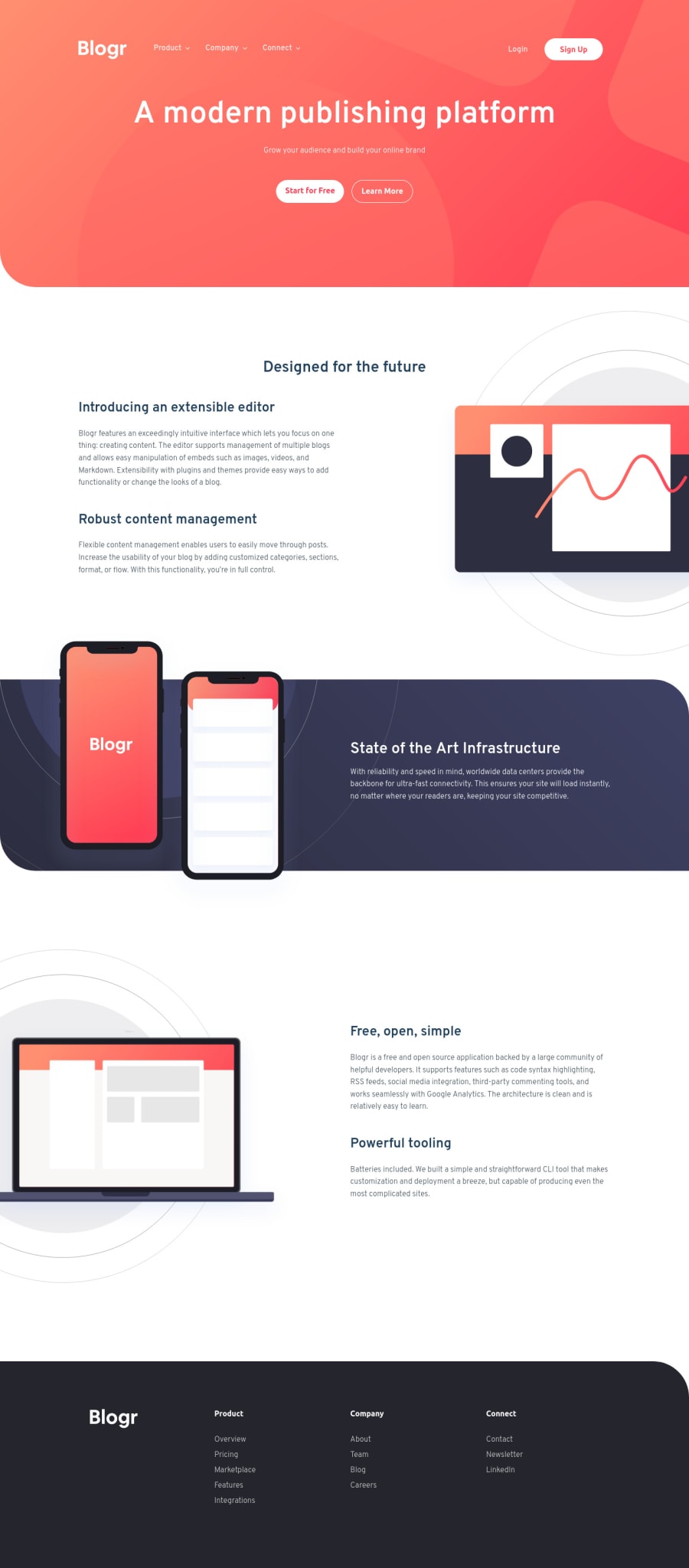
Design comparison
SolutionDesign
Solution retrospective
Is it common practice to declared the section height and just center the content within the fame? I find it to be more convenient than adjusting padding/margin pixel by pixel until the content expands the section to match the design's.
Community feedback
- @ChamuMutezvaPosted almost 3 years ago
Nice work Rod. Well done. I have some feedback on the following code:
<div class="home__text mt-4 mb-5">Grow your audience and build your online brand</div> <div class="d-flex gap-3 justify-content-center"> <div class="home__cta-primary btn btn-white">Start for Free</div> <div class="home__cta-secondary btn btn-outline btn-outline-white">Learn More</div> </div>- while there is nothing wrong with the use of divs, but when there is a semantic element that can present the same content that should be the first preference for accessibility reasons. The first div in the above code in my opinion should be a heading element (h2 in this case). The 2 divs with the btn classes should have been anchor elements, links to extra content.
Happy coding
Marked as helpful0@bague-rodnelPosted almost 3 years ago@ChamuMutezva Good catch bruh. I thought I got this area reviewed.I think more about the class than the element since I'm working on my head how I will target them later, that I forget the html tags. This is the result of this thought process and emmet expansion. :P
Thanks again!
0
Please log in to post a comment
Log in with GitHubJoin our Discord community
Join thousands of Frontend Mentor community members taking the challenges, sharing resources, helping each other, and chatting about all things front-end!
Join our Discord
