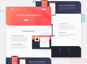
Design comparison
SolutionDesign
Solution retrospective
Main issue I'm having here is the layout is fine in mobile OR desktop, but moving from mobile to desktop (the breakpoint is at 800px), where the first illustration is moved off the page slightly, it messes up the whole screen and you can suddenly scroll off the page.
I know this is a real edge case, but its annoying that it seems to just break everything. overflow-x and max-width don't seem to be able to fix it either.
Join our Discord community
Join thousands of Frontend Mentor community members taking the challenges, sharing resources, helping each other, and chatting about all things front-end!
Join our Discord
