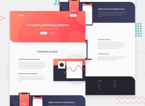
Design comparison
SolutionDesign
Solution retrospective
Took my own approach when it comes to the side images, since the design will not look nice on very large screens (>1440px) if these images are positioned this way.
In addition, did not add the background for the "State of the Art" section on desktop
Community feedback
Please log in to post a comment
Log in with GitHubJoin our Discord community
Join thousands of Frontend Mentor community members taking the challenges, sharing resources, helping each other, and chatting about all things front-end!
Join our Discord
