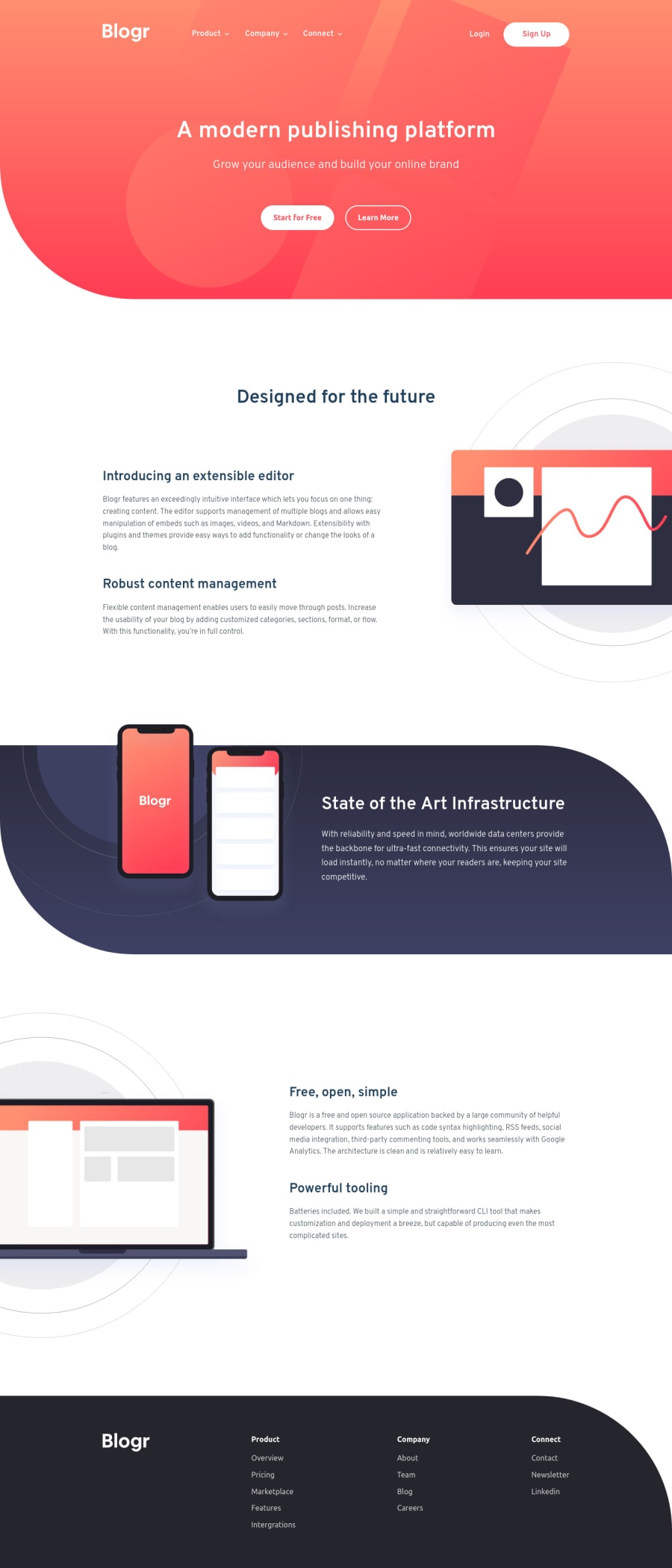
Design comparison
Solution retrospective
Hey there!
I'm realising that I don't have a uniform way of creating dropdown menus. However, toggling classes to show or hide a dropdown menu seem uniform in my workflow. The question is: What's the "best" set of styles can be swapped to create a more animated/smooth toggling? display: none and display: block seem to not work well
Community feedback
- @madegilangadityaPosted over 2 years ago
Hi, congratulation for finishing the challenge, my suggestion for the dropdown menus, maybe try mix
visibilityandopacityon it instead using display, for the mobile can manipulatemax-heightand visibility. Hope can give you insight on it1@pilatechPosted over 2 years ago@madegilangaditya thank you so much. I will definitely try that on my next project - which I’m currently 20% through.
0
Please log in to post a comment
Log in with GitHubJoin our Discord community
Join thousands of Frontend Mentor community members taking the challenges, sharing resources, helping each other, and chatting about all things front-end!
Join our Discord
