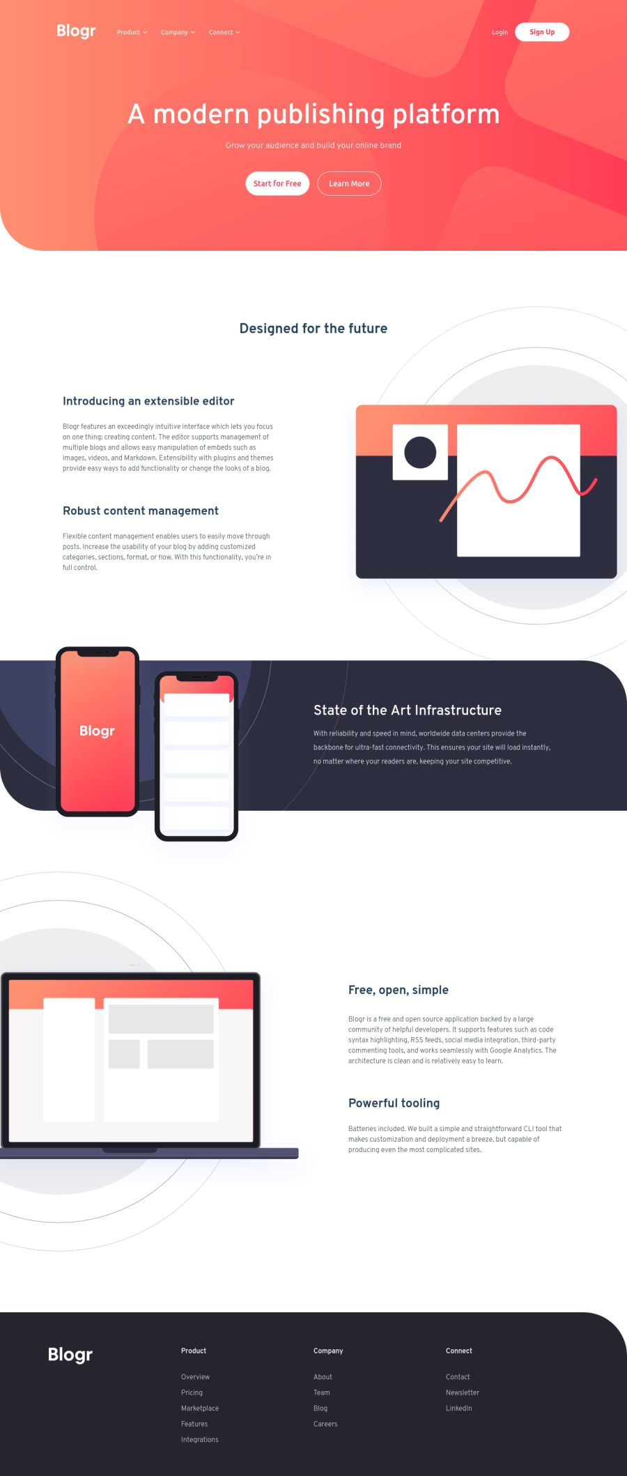
Blogr landing page using ONLY HTML, CSS ,and Vanilla JS
Design comparison
Solution retrospective
Really enjoyed making this landing page! my questions are:-
-
is there a better way to add transition or animations to the nav dropdowns? i tried using opacity 0 or transform: scale(0,1) but it doesn't hide the content completely like display: none does. and its not possible to animate when display is none. is there a better way?
-
is there a good source online that teaches how to use gradients better? i need to learn better ways to use gradients and box shadow as well.
any other feedback is appreciated! :D
Community feedback
- @ChamuMutezvaPosted about 3 years ago
hi.
- use a button with an image (hamburger) as a child and another button with the close image. Add
aria-labelto the button as an image will not provide the purpose of the button to assistive tech users and usealt=""on the image as it is just a decorative image. - On the last point - they are sections in the design where images have been provided for mobile and another (bigger version) for desktop. One choice to implement them can be to use them as background images. In the event that you use the
imgelement, usingdisplay: noneto hide eg the desktop image on mobile is not a recommended technique - it wastes bandwidth and considered expensive as all images will be downloaded by the user's device even though the user wont use the other image. Consider then a site where you are having 10 images. Responsive image techniques (srcset , picture element) will allow users on mobile to get only images that has been set to be viewed on mobile , making the page load faster among other things. See the article below for further explanation, responsive images
Marked as helpful1@mohsin316Posted about 3 years ago@ChamuMutezva thank you for elaborating more on that last point. That makes a lot more sense in terms of efficiency. Also noted on the button for hamburger menu. Thank you for explaining!
0 - use a button with an image (hamburger) as a child and another button with the close image. Add
- @ChamuMutezvaPosted about 3 years ago
Hi Mohsin.
- the site is generally scaling well from small devices to desktop. Well done.
- the structure of the html is not correct in my opinion, they are several adjustments that needs to be made:
- The following elements are acting as the hamburger and close button
<div class="ham">
        <img class="lines" src="images/icon-hamburger.svg" alt="">
        <img class="cross" src="images/icon-close.svg" alt="">
  </div>
Where possible use semantic elements, the images above can not replicate a button in functionality. Keyboard and assistive tech users will not be able to use or know that the images are interactive .
- the immediate child of a
ulelement should be anlielement, it should not be a div ,or any other elements. - if you do not intend to use
srcset, i would suggest to remove it from your image<img data-arrow-one class="arrow-light" src="images/icon-arrow-light.svg" alt="" srcset=""> - the
lielements should have ananchoras a child in this scenario - they are links to other pages or sections<li class="li">Overview</li> - the
mainelement is important , check the link in the report for further explanation. In short that is wher the main content of the site should be. - i see you have
<div class="desktop"></div>, which you are using to display the image as a background image in desktop view. The equivalent message in mobile is shown as :
<div class="mobile">
    <img src="images/illustration-laptop-mobile.svg" alt="" srcset="">
  </div>
While the method may work, this method is not recommended - you need to look responsive images techniques , the srcset is one such method and another one will be the picture element.
Marked as helpful1@mohsin316Posted about 3 years ago@ChamuMutezva
Hello Chamu. Thank you for taking the time to type and give valid criticism on this project. I really appreciate this response.
- thank you for your kind words they mean a lot.
- I agree that the HTML for this is not the best. especially the navbar. will make sure that I use the right tags next time.
- so rather than using the images as a toggle. I should have instead used a button and set the background image of that button to either one of those images?
- I'll keep in mind that li need to be after the uls.
- yes I forgot to remove the srcset from the images.
- I realized after submitting that should have used anchor tags and not just the li for the links
- I rarely add a main but I need to start adding it.
- I didn't quite understand this last point, could you please elaborate further?
0
Please log in to post a comment
Log in with GitHubJoin our Discord community
Join thousands of Frontend Mentor community members taking the challenges, sharing resources, helping each other, and chatting about all things front-end!
Join our Discord
