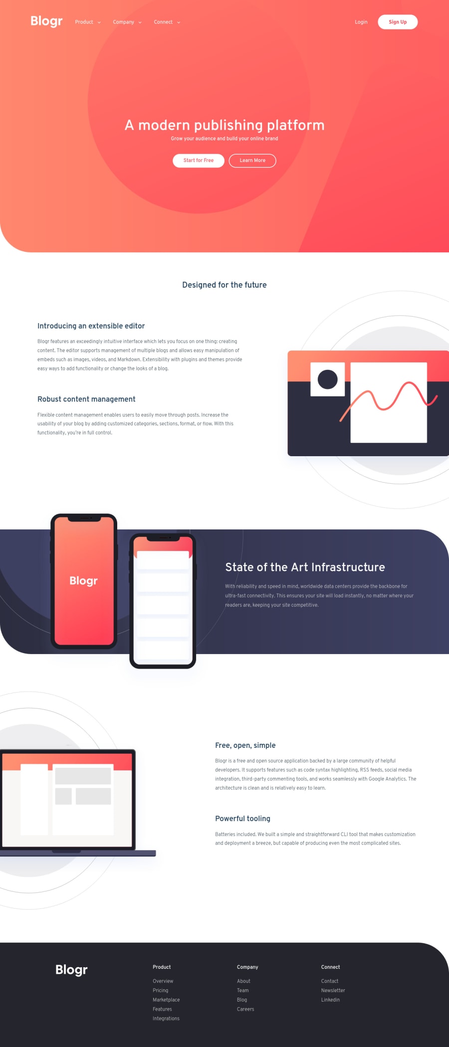
Design comparison
SolutionDesign
Solution retrospective
Any feedbacks are welcome :)
Community feedback
- @ChamuMutezvaPosted over 3 years ago
- the site is not responsive , several elements are not in place especially for mobile and medium devices.
- the navigation list on mobile is overstretched and it does not seem to be working on my end.
- headings are supposed to ascend in order. The first being an
h1giving a general meaning of the content in the page. - the footer links should be in anchor elements as well.
- the hamburger is supposed to represent a button (an interactive element) , using the image on it's own does not assist users who rely on assistive technology
** SUGGESTION **
- this is tricky challenge and if you haven't done one of the lower level challenges yet, i would encourage to start there first and get the basic right first.
0
Please log in to post a comment
Log in with GitHubJoin our Discord community
Join thousands of Frontend Mentor community members taking the challenges, sharing resources, helping each other, and chatting about all things front-end!
Join our Discord
