Design comparison
Solution retrospective
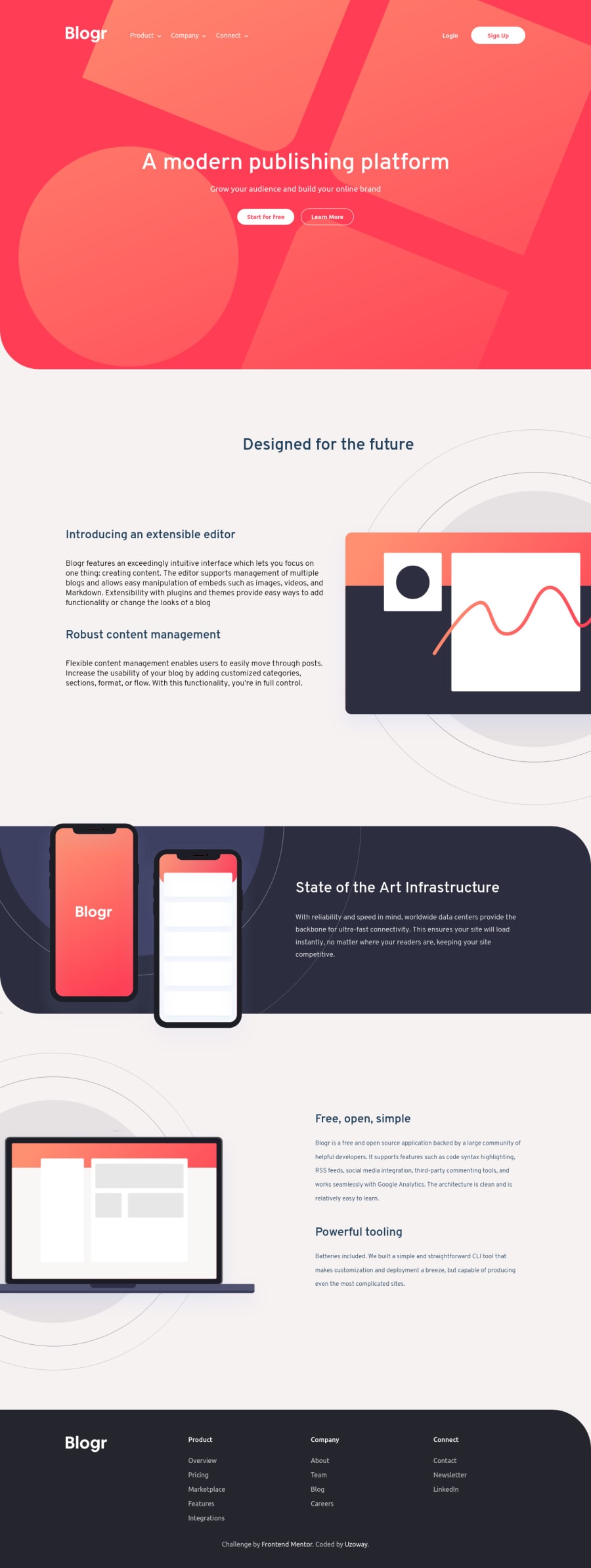
Hello! I just completed another challenge. It was a bit of a struggle making the site responsive on various mobile screen sizes and making the dropdown menu functional. I'd really like to know how I did on the responsiveness of the site, if it looked close to the design. Any other feedback will be highly appreciated.
Community feedback
- @P-amian45Posted about 4 years ago
Hey Victor that's a nice job, but like you probably know the responsive part isn't good with my phone. I mean, the heading part with the two buttons are totally break. You can do it 🤗. Expect this little problem everything is fine.
I can suggest you to add a little CSS animation, it can be lore juicy 🤭
0@uzowayPosted about 4 years ago@P-amian45 Thank you for the feedback👍🏾 For the buttons, I'm already working on that... Couple of other peeps pointed that out too.
0
Please log in to post a comment
Log in with GitHubJoin our Discord community
Join thousands of Frontend Mentor community members taking the challenges, sharing resources, helping each other, and chatting about all things front-end!
Join our Discord
