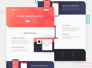
Design comparison
Solution retrospective
The most difficult part of the project for me was to create the mobile menu with its dropdowns. I could not do it with css alone and I finished that part with js using fadeIn() and fadeOut() for the dropdowns and show() and hide() for the actual mobile menu when click on the hamburger svg.
Another difficult part that I also made it work with js is to rotate just the arrow that is hovered. In my case using css transform: rotate(180deg) actually rotate all three arrows not just the one hovered. I would like to know the best way to do this part because I am not sure that my solution is in the best practice.
I also struggled with the background of the intro part where you need to have a background with linear-gradient and a svg on top positioned just right.
In the end it took my about 15 hrs to finish the project
Community feedback
Please log in to post a comment
Log in with GitHubJoin our Discord community
Join thousands of Frontend Mentor community members taking the challenges, sharing resources, helping each other, and chatting about all things front-end!
Join our Discord
