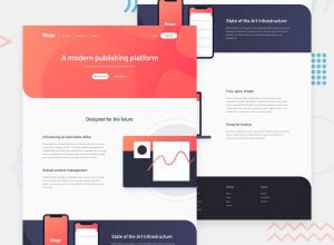
Design comparison
SolutionDesign
Solution retrospective
The navbar was a tricky component to make and a bit complex too, I tried to make it as close as possible. I used flex-box for positioning of the elements and i found that its good for only one view but not for responsive design, for responsiveness always use CSS GRID. I would recommend to start mobile first rather than desktop first.
Community feedback
Please log in to post a comment
Log in with GitHubJoin our Discord community
Join thousands of Frontend Mentor community members taking the challenges, sharing resources, helping each other, and chatting about all things front-end!
Join our Discord
