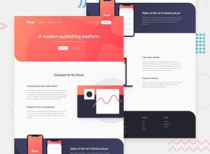
Design comparison
SolutionDesign
Solution retrospective
At first I thought this will be easy one, but I stucked and spend a lot of time on positioning of the elements in the features section. Anyway, at least it was good practice. In JS I wrote almost two times shorter code for mobile menu than before, so I am happy about that :) If anyone have sugestions, please feel free to let me know. Thank you.
Community feedback
Please log in to post a comment
Log in with GitHubJoin our Discord community
Join thousands of Frontend Mentor community members taking the challenges, sharing resources, helping each other, and chatting about all things front-end!
Join our Discord
