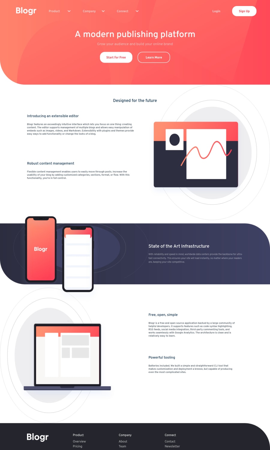
Design comparison
SolutionDesign
Solution retrospective
-any feedback is welcome uwu
Community feedback
- @GHamza-DevPosted over 3 years ago
Hi Robert Pandele👋
I have some suggestions for you (I would really push myself to take into consideration the following suggestions)
- Use
h1,h2,h3... if needed instead ofdivorp(title,titel2,editorTitle...). - Use anchor tag
afor links. - Use
imgtag for your logos withaltattribute (<img src="images/logo.svg" alt="blogr"/>). - Use
ulelement for lists (lists of links in the footer and dropdown menus). - For the humburder button should have a cursor pointer:
.hamburger {
    ....
   cursor: pointer;
   ...
}
Otherwise, you did a nice job!
HAPPY CODDING!!0 - Use
Please log in to post a comment
Log in with GitHubJoin our Discord community
Join thousands of Frontend Mentor community members taking the challenges, sharing resources, helping each other, and chatting about all things front-end!
Join our Discord
