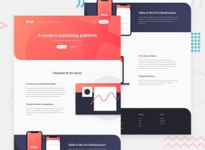
Design comparison
Solution retrospective
Need reasonable feedback about this project. Thanks in advance!
Community feedback
- Account deleted
Hi there, that looks pretty awesome. There are two minor things I might suggest. You mobile menu button should be a button. Thats better for accessibility as people can easily tab into it and activate it with the spacebar. You can nest your spans inside a button element without problems or directly make a button background image.
Next thing is your submenu design. I think they can have a little space between them. But aside from that minor detail, if I open all three of them in mobile the topmost text is outside my view and also overlaps the closing menu item. That definitely looks bad and I have to reload the page to close the menu again.
I would consider on your .navbar-nav top: 50px; remove right: 50%; remove transform: translate(50%, -50%);
That way to box stays in place and opens downwards.
But the rest looks awesome.
Keep on coding :)
Marked as helpful1@KajaiaPosted almost 3 years ago@shantam8 Thank you David, valuable feedback. I will try to make changes later.
0
Please log in to post a comment
Log in with GitHubJoin our Discord community
Join thousands of Frontend Mentor community members taking the challenges, sharing resources, helping each other, and chatting about all things front-end!
Join our Discord
