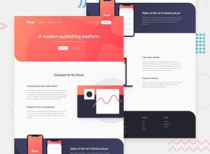
Design comparison
SolutionDesign
Solution retrospective
Please kindly take a look and provide any feedback that you may have.
Community feedback
- @Fede2797Posted over 1 year ago
Awesome solution! I had a hard time making the "State of the art" section positioning and responsiveness. Did you find it hard as well? If not, any advice on how to improve that skill?
Thanks in advance :D
Marked as helpful0@9CB5Posted over 1 year ago@Fede2797 Thank you :)
It's a tricky section for sure, but I think a solid understanding of flexbox and
absolutepositioning should be enough to tackle layouts like this.1
Please log in to post a comment
Log in with GitHubJoin our Discord community
Join thousands of Frontend Mentor community members taking the challenges, sharing resources, helping each other, and chatting about all things front-end!
Join our Discord
