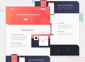
Design comparison
Solution retrospective
This was my first landing page challenge, so it was demanding. I'm happy with the result being this the first full landing I made, but I'm sure I could have done better.
One thing that turned out a bit messy was the fact that I didn't plan extensively from the beginning how all the elements would behave in different devices. My approach is always mobile first, but I didn't pay much attention to desktop at the start, so when the time for desktop media queries came, there was a lot of fixing to do, and I'm aware I could have made it better now.
There are lots of notes I have put myself, and any suggestions are welcome. For the time being I will keep making new challenges and I will revisit this one in the future to redo it better, if I feel it necessary.
Thanks
Community feedback
Please log in to post a comment
Log in with GitHubJoin our Discord community
Join thousands of Frontend Mentor community members taking the challenges, sharing resources, helping each other, and chatting about all things front-end!
Join our Discord
