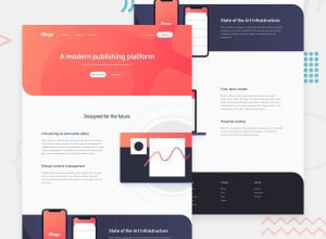
Design comparison
SolutionDesign
Solution retrospective
It was hard to make the layout work on this landing page. I had to use positioning absolute and even negative margins, which I don't think is a good idea, but if I didn't, the layout wouldn't work on smaller screens. Please, suggest better practices. I still haven't figured out how to make everything aligned as it is in the designs
Community feedback
Please log in to post a comment
Log in with GitHubJoin our Discord community
Join thousands of Frontend Mentor community members taking the challenges, sharing resources, helping each other, and chatting about all things front-end!
Join our Discord
