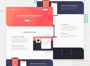
Design comparison
Solution retrospective
Any feedback would be appreciated. Is the reverse margin an acceptable solution to the design of challenge ?
I would like some input on how to organise my code to be neat and organised as I hope to get a job one day as a junior frontend developer.
Any criticism will be well received.
Community feedback
- @duncanwhytePosted almost 3 years ago
Thanks I see the issues now. Thank you very much.
0 - @duncanwhytePosted almost 3 years ago
Sorry I'm sort of new to this what is a report ?
0@JhoellOpeyemiPosted almost 3 years ago@duncanwhyte The report is under the design comparison slider and above this comment section :)
0 - @JhoellOpeyemiPosted almost 3 years ago
Nice work Duncan Whyte! One issue though. There's an horizontal scroll on mobile screens, you could fix that by adding overflow-x: hidden; to the body. And you might want to have a look at your report
0
Please log in to post a comment
Log in with GitHubJoin our Discord community
Join thousands of Frontend Mentor community members taking the challenges, sharing resources, helping each other, and chatting about all things front-end!
Join our Discord
