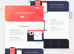
Design comparison
Solution retrospective
Good day Frontend Mentor Community! Here is my solution to the Blogr Landing Page challenge.
First time doing a whole web page challenge and it is indeed difficult for me, a first timer and was only used to making components at a smaller scale. I focused more on the layout and responsiveness in this challenge.
Building this one out made me realize that styles got repeated over and over again, code gets longer which needs breaking them into smaller parts, and having values as custom properties or variables is a must in a bigger scale projects.
I have some difficulties in this challenge mainly on:
- Organizing my code and file structure
- Breaking apart my code into reusable ones (using
mixinsor utility classes) - Setting custom properties for styles (such as
font-size,transition, etc) - Dealing with responsiveness in every screen sizes (afraid of not following best practices)
Let me know if there are some useful tips/hacks in overcoming these difficulties of mine and also in improving the quality of my code. Happy to hear every feedback and advice from you all!
Community feedback
Please log in to post a comment
Log in with GitHubJoin our Discord community
Join thousands of Frontend Mentor community members taking the challenges, sharing resources, helping each other, and chatting about all things front-end!
Join our Discord
