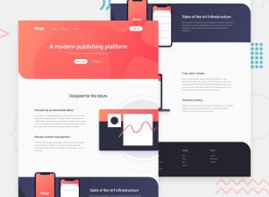
Design comparison
Solution retrospective
feedback needed...
Community feedback
- @tedikoPosted over 3 years ago
Hello, XIII! 👋
Really good job on this challenge! I like that you tried something new and create this onload animation! This is just my suggestion but maybe make this onload red background to be 100% height of your whole site and disable scrolling during this animation (because now i can scroll down and there's nothing but white 😅) and remove these two buttons since i won't click them anyway in that animation because there is not time. Just leave logo, h2 and paragraph.
Additionaly, you can make your page more accessible for keyboard users. Set some
outlineto your links on focus state. Continuing this thread, due to the fact that yournav__linkis a div i can't access it using my keyboard. I think you can either use role on that or maybe change toatag.Good luck with that, have fun coding! 💪
1@minibruspPosted over 3 years ago@tediko thanks, yeah you're right it looks bad when user can scroll during animation will try your suggestions. Thanks for the feedback really appreciate it. Looking forward for more pointers from you in the future. ^^
0
Please log in to post a comment
Log in with GitHubJoin our Discord community
Join thousands of Frontend Mentor community members taking the challenges, sharing resources, helping each other, and chatting about all things front-end!
Join our Discord
