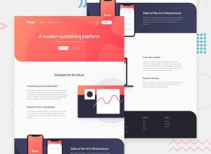
Design comparison
Solution retrospective
In this project, I had the opportunity to fry some neurons working a little more with Javascript. It was really challenging and a lot of fun to find solutions for the different menus.
In this project I also had the opportunity to work with background-image on pseudo-elements like ::after. Finding the correct way to add the links to the images was a bit tricky. "Living and learning" :P
I liked the final result... next time I'll do better! Suggestion where I can improve? Please comment. ;)
Community feedback
- Account deleted
Activate the mobile menu then switch to desktop while it is still active and see what happens.
0@joelsalmeidaPosted over 3 years ago@thulanigamtee This bug was happening both on the desktop and on the mobile menu. Thanks for the tip. I made some adjustments and now it looks good.
0
Please log in to post a comment
Log in with GitHubJoin our Discord community
Join thousands of Frontend Mentor community members taking the challenges, sharing resources, helping each other, and chatting about all things front-end!
Join our Discord
