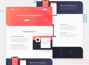
Design comparison
Solution retrospective
Hello comunity!!! How are you all doing?
This is my first attempt on this project and I faced several challenges with it. I would like to ask you if the navbar technique used was correct or do you recommend another one that could have more functionalities or present a cleaner code.
Hope you are all having a great day! :)
Community feedback
- Account deleted
Hi, Luis. Mobile menu is sticky but close button is not. This is the biggest problem i can see. And there is some overflow on small screen.
1@luibernipPosted over 3 years agoHello @gurkanozer, thank you for your recommendations. Changes have been performed to the close button. I'm currently analizing the overflow issues you encountered.
Once again thank you for the advise. Hope you have a great day! :)
0
Please log in to post a comment
Log in with GitHubJoin our Discord community
Join thousands of Frontend Mentor community members taking the challenges, sharing resources, helping each other, and chatting about all things front-end!
Join our Discord
