
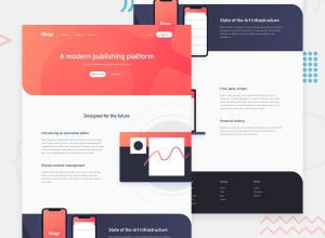
Blogr Landing Page - HTML/CSS/JS/Astro

Design comparison

Solution retrospective
The positioning on a lot of the images on this page were tricky. Did my best to have them positioned correctly for the 1440 resolution, but the method used isn't too friendly for responsiveness. Lots of learning done with grid and how to place elements. Any suggestions on how to position these better and in a more responsive way?
Learned how to use astro as well, that was interesting and added some overhead to the challenge. Came up against a few framework quirks like adding multiline text and that css is only scoped automatically to the component when used within the style tag. Putting the styles in a separate file doesn't work unfortunately. Ran into some more issues getting all the images to show up on Github pages but eventually got it all working.
Community feedback
Please log in to post a comment
Log in with GitHub
Join our Discord community
Join thousands of Frontend Mentor community members taking the challenges, sharing resources, helping each other, and chatting about all things front-end!
Join our Discord