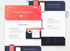
Design comparison
Solution retrospective
Hello Everybody!!!
This is my first Junior challenge, i have been chewing through the Newbie challenges and to my surprise the difference between those and this one is abysmal, this challenge is like 4 newbie ones stacked together and took me around 7 hours to complete, it didn't had any new feature in it, but the sheer size was in another level.
-I need feedback in the menu responsiveness, when the user resizes the view port and the media query is activated, the menu might do some strange things, the solution i found was using the ''resize'' event listener on JavaScript to control how the menu works when switching to larger devices, but i think that solution might be considered bad practice, so i would like to hear any tip on how to handle interactive menus when changing size.
-Also i would like some tips when using big background images, in this case the background pattern was around 3000px in width, and i had trouble making it fit nicely in the small header space.
Anyways, thanks in advance, it may look like a lot of questions, but this challenge really ''challenged'' me, so i think i can learn a lot whit the feedback in this one, since the newbie challenges didn't really put much strain on me.
Community feedback
Please log in to post a comment
Log in with GitHubJoin our Discord community
Join thousands of Frontend Mentor community members taking the challenges, sharing resources, helping each other, and chatting about all things front-end!
Join our Discord
