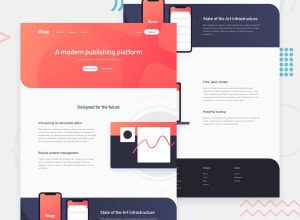
Design comparison
Solution retrospective
Any feedback on how can I improve are welcome :)
Community feedback
- @ApplePieGiraffePosted over 3 years ago
Hello there, prakash! 👋
Nice work on this challenge! 🙌 Your solution looks pretty good and is responsive! 😀
I'd like to suggest turning the navigation links in the submenus in the header of the page (and the those in the footer of the page) into actual links by wrapping each of them in an anchor tag.
Also, using more meaningful tags such as the anchor tag or the
<button>element for the rest of the interactive elements on the site (including the elements that open/close the submenus in the header of the page) would be a good idea to improve the semantics of your HTML and the accessibility of your solution. 😉Hope that is a little helpful. 🙂
Keep coding (and happy coding, too)! 😁
1
Please log in to post a comment
Log in with GitHubJoin our Discord community
Join thousands of Frontend Mentor community members taking the challenges, sharing resources, helping each other, and chatting about all things front-end!
Join our Discord
