Design comparison
Solution retrospective
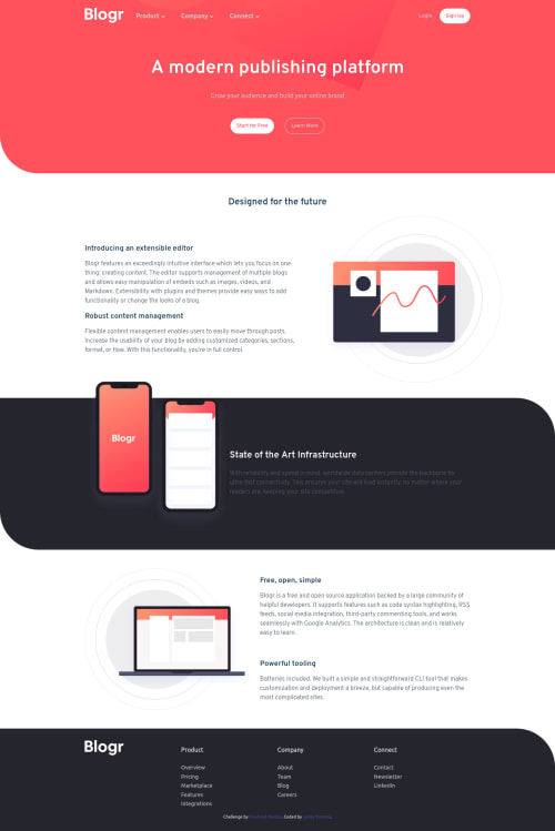
Really had a hard time with the navigation part. In the end I just tried my best to make it work with messy CSS employing 2 media queries just for the nav responsiveness. Any good resource to help me handle responsive navigation better?
Thanks in advance 🤝🏾
Community feedback
- @DavidMorgadePosted over 2 years ago
Hello Lesley, congrats on finishing the challenge!, don't bash yourself, it looks pretty good and the nav is working perfectly!
If you don't mind, I will like to give you some feedback.
-
The problem that you had is that you made your
header
, too much content, try getting only the logo, the navbar and the singin buttons as your header, and then divide the rest of the content conmain
andsections
. The part of your website that is just after the navbar is what usually people callhero
, this should not be a part of your header IMO. -
You also have saved a lot of time on paddings and margins on the
header
just calling flex on your header and aligning the content should do the job:
.primary-header { justify-content: space-around; display: flex; flex-direction: column; align-items: center; }
But your solution got the same result so, don't worry about that!
Apart from that your project looks great IMO.
Hope my feedback helps you in future challenges, good job!
Marked as helpful0@LeskimPosted over 2 years ago@DavidMorgade Thanks David🤝🏾 ...I'll divide the header as such in the future
1 -
Please log in to post a comment
Log in with GitHubJoin our Discord community
Join thousands of Frontend Mentor community members taking the challenges, sharing resources, helping each other, and chatting about all things front-end!
Join our Discord