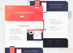
Design comparison
Solution retrospective
Feedback is appreciated
Community feedback
- @MojtabaMosaviPosted over 3 years ago
Hi, nice work, the only things that come to mind you should use one <h1> per page mainly because it makes you solution more accessible and consider spending a bit time learning about methodologies like BEM.
Keep coding :)
0 - @yunus-ujjainiPosted over 3 years ago
Hi,
The website looks good, On middle-sized devices, it is breaking. Though can be fixed.
Nice animations though it seems like you have forgotten to change the hamburger icon to the close button when menu is opened on mobile devices.
Keep going
0@JonKohJJPosted over 3 years agoHi thanks for the feedback, thanks for pointing out the burger animation. Also, I realized that the site looks bigger than expected. I am using a 24 inch monitor to code this and hence, when viewed on a laptop for example, everything looks bigger and more zoomed in than expected. Any ideas how to rectify this?
0@yunus-ujjainiPosted over 3 years ago@JonKohJJ Hey sorry I was off for a while.
If you are using units like pixels, rem and em to do sizing of your content. They won't shrink according to the screen size.
I sometimes use vw and vh units if I wish to define size based on viewport.
Or you can always have one media query for extra large screen and get the sizing done for them separately.
0
Please log in to post a comment
Log in with GitHubJoin our Discord community
Join thousands of Frontend Mentor community members taking the challenges, sharing resources, helping each other, and chatting about all things front-end!
Join our Discord
