Submitted over 3 years ago
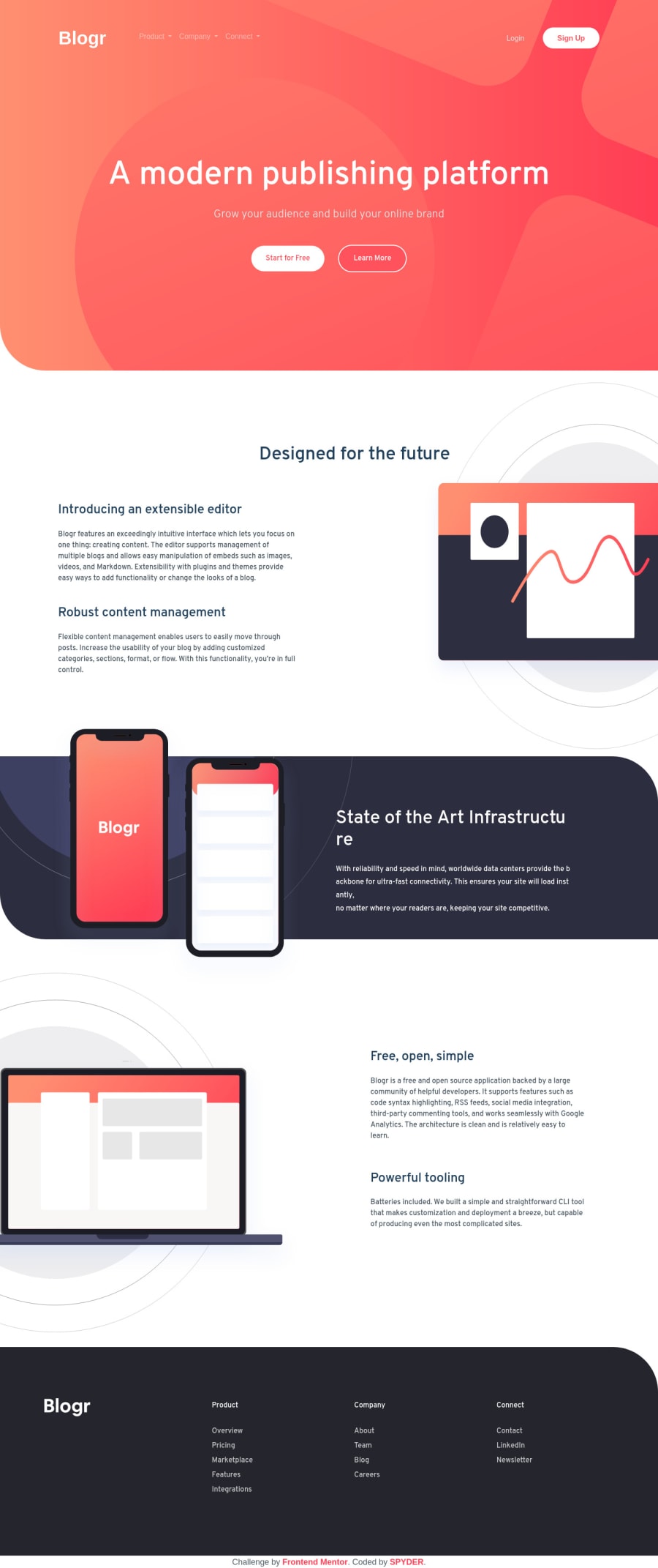
Blogr landing page for mobile(<576px) and desktop using Bootstrap4.5
@ratan17
Design comparison
SolutionDesign
Solution retrospective
Alright guys I'm back with another solution! FEM challenges really make me humble about my knowledge of Front End Web.
Ignore the accessibility issues and the navbar. Navbar is not according to the design files it was built using bootstrap 4.5
And the site is code for desktop(>1200px), mobile(<576px). I'll soon code for medium sized devices as well. EARN GUARANTEED 5-30 POINTS ON GIVING FEEDBACK Till then I'm looking forward to take constructive feedbacks from you all.
Community feedback
Please log in to post a comment
Log in with GitHubJoin our Discord community
Join thousands of Frontend Mentor community members taking the challenges, sharing resources, helping each other, and chatting about all things front-end!
Join our Discord
