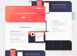
Design comparison
SolutionDesign
Solution retrospective
Any feedback to improve is highly appreciated .
Community feedback
- @ApplePieGiraffePosted over 3 years ago
Hi, Priya Nayak! 👋
Nice effort on this challenge! 🙌
I'd like to suggest,
- Making sure the text below the illustration of the phone in the "State of the art infrastructure" section doesn't get covered up by the illustration in the tablet layout of the site.
- Making sure the heading of the "Designed for the future" section doesn't cover up the text below it, as well.
- Perhaps closing the other submenus in the header of the site when another submenu is opened (so that there is only one open submenu at a time) would be a good idea. 😉
Keep coding (and happy coding, too)! 😁
0@priya180975Posted over 3 years ago@ApplePieGiraffe Thank you so much for the feedback
0
Please log in to post a comment
Log in with GitHubJoin our Discord community
Join thousands of Frontend Mentor community members taking the challenges, sharing resources, helping each other, and chatting about all things front-end!
Join our Discord
